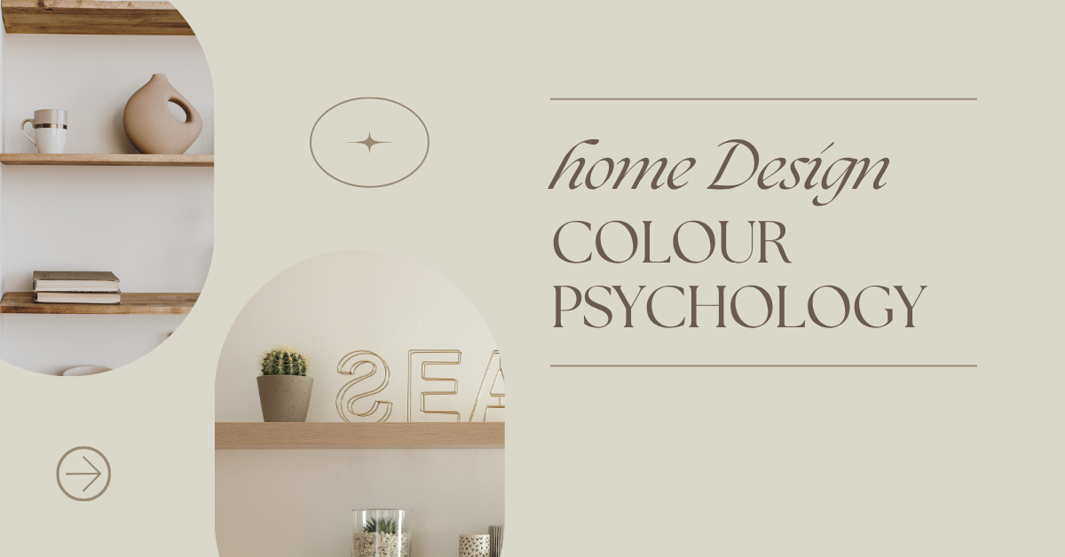
Introduction: Colour as the New Wellness Tool
In 2025, colour is doing more than making a space look good—it’s helping people feel good. With home now functioning as a workplace, relaxation zone, and creative space, homeowners and designers are turning to colour psychology to enhance focus, boost energy, or create calm. This blog explores how colours affect emotions and which shades are trending in modern interiors.
1. Calm & Connection: Soft Neutrals Return
-
Popular Colours: Mushroom taupe, oatmeal beige, warm greys, soft clay.
-
Emotional Impact: Promote peace, warmth, and a sense of balance.
-
Usage: Ideal for living rooms and bedrooms to encourage calm and continuity.
-
Design Tip: Layer different tones of the same hue for depth without overstimulation.
2. Focus & Clarity: Earthy Greens Lead the Way
-
Popular Shades: Sage, olive, eucalyptus, and moss green.
-
Psychological Effect: Symbolises renewal, harmony, and concentration.
-
Trend Insight: Green is the new neutral, often paired with natural textures like oak, cane, and linen.
3. Bold & Balanced: Terracotta and Clay Tones
-
Why it works: Warm terracottas and burnt oranges bring life and energy without being too overpowering.
-
Emotional Connection: Grounding, earthy, and perfect for creating an inviting feel in social spaces like kitchens and dining areas.
4. Sophistication & Safety: Deep Blues Make a Statement
-
In Demand: Navy, petrol blue, deep indigo.
-
Effect on Mood: Offers stability, trust, and intellect—great for home offices or studies.
-
Design Match: Looks stunning with metallics like brass or copper for a modern contrast.
5. Creativity & Expression: Pops of Lavender and Coral
-
Trending Accents: Pastel purples, coral pinks, muted lilac.
-
Emotional Tone: Stimulates imagination and playfulness—ideal for creative corners, studios, or kids’ rooms.
-
2025 Insight: These are often used as statement furniture pieces or painted feature walls rather than whole-room colours.
6. Minimalist Energy: Black and White Reimagined
-
What’s new: Off-whites with warm undertones and matte black accessories.
-
Mood Impact: Simplicity, control, and timeless design.
-
Use Case: Popular in Scandinavian or Japandi-style interiors that focus on mindful living.
7. The Biophilic Colour Movement
-
Concept: Colours inspired by nature to support mental wellness and sustainability values.
-
Colours in Play: Stone grey, leaf green, sand beige, sky blue.
-
Emotional Benefit: Helps restore a sense of calm and connection with nature, especially in urban environments.
Conclusion: Colour is Emotion
In 2025, designing a home is as much about how it feels as how it looks. Homeowners are using colour intentionally to align spaces with their emotional needs. Whether you’re seeking calm, productivity, or energy, colour psychology is your design superpower.